

Pretty Dashboards, Still Flying Blind
Radical Simplicity in Executive Reporting => Better Decisions.
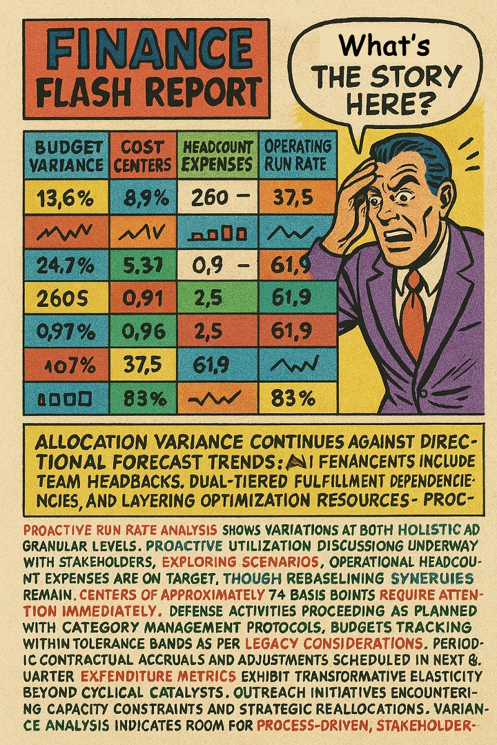
My finance business partner, directed by his boss, our new CFO, came to my leadership meeting with an updated monthly flash report. I had wanted better financial reporting for a while now, but what I saw left me disappointed, confused and angry.
What I saw was a smattering of colours and numbers on a page, in a table, with the table somehow containing tiny graphs within its cells. Each column represented a KPI, but I couldn’t recognise what most of them. The bottom half of the page was filled with point 7 text, and was giving me a splitting headache.
“Budget, outlook, plan - don’t they all mean the same?” I asked my finance BP. “No, they are different”, and he went on to explain in detail.
“How much money do I have to spend this year? Isn’t this in the budget column?” I asked.
“No”, came the response, “the budget was fixed as part of the planning process, you need to look at the forecast column”.
“Then why have you included the budget number in the dashboard if that is no longer relevant”?
It took the next 60 minutes, plus 2 more meetings, with me and my full leadership team, to understand what each metrics meant, which of these were relevant, and why each mattered. Talk about expensive meetings!
Even after all this explanation, it took me 30 minutes each week to decipher the dashboard, and try and identify things I need to pay attention to.
It drove me nuts!
Signal from Noise
Information overload is a real problem for time poor executives. Emphasise simplicity in your dashboards - use a smaller number of metrics that drive real action.
Commentary is a powerful tool to highlight the ‘why’ and ‘so what’. Use this to your executive’s advantage.
Show visual restraint - use visual elements sparingly to highlight important information and maintain white space for cognitive ease.
Infobesity - The Paradox of Information Overload
Data is truely BIG these days - 400 million terabytes of data are created everyday globally and growing at 26% CAGR. An organisation on average sources data from 400 data sources. Cloud data platforms like AWS & Azure, and tools like PowerBI & Tableau have made it effortless to visualise data & extract insights (remember the good old days when you needed an engineer to create a Business Objects dashboard??).
The consequence of technology advancements is information overload - more data is easily accessible and hence more data is presented to executives. Executives are after all human, and like all other humans, we have limited cognitive capacity. We receive a barrage of information on a daily basis which makes it difficult for us to identify what’s important and filter out what’s not.
I personally have also found the volume of data shared with me causes a lot of stress and takes an emotional toll, which many times manifests itself via physical symptoms.
Information overload often results in analysis paralysis, inability or unwillingness to interrogate and understand information, and ultimately sub-standard decision making.

Why do Business Intelligence (BI) teams keep creating complexity & over share information
Here’s a sneak peek into the mind of a BI analyst (often times encouraged by their Head of BI) -
Oooh I want to show off my technical skills, or what my new tool can do
A simple table? Nah, much cooler to create an obscure chart even if it’s difficult to read
I have so much data available, I don’t want it to go to waste, so let me include more of it in my dashboard
What if they wants more information, I don’t want to leave anything out and look stupid
If am being real honest - I don’t truly understand what decisions the data needed to support
My executive claimed to be a ‘visual person’, so I’ll include colourful charts
Let’s face it - we all have analysts in our teams who are guilty of this, and this problem is only getting worse. Most executives don’t raise a fuss and don’t ask for the unimportant stuff to be stripped away - they get their EA or 2IC to interpret dashboards and email them the top 3 insights that matter, and many just make gut-feel decisions.
Playbook - Making Data Work for Executives
When I was a business intelligence manager (a long time ago when Windows XP was cutting edge), I thought our dashboards weren’t appreciated because our executives weren't sophisticated enough. They would ask for simple tables and often times, reports in Excel! While we would always deliver to the executives wants, I felt I was giving them a faster horse, leaving me frustrated.
My perspective changed completely when I became an executive myself and had to rely on data and insights to run my business unit. As an executive, I had very limited time (usually in between meetings), to read reports and make decisions. I didn’t have the patience to suffer flashy dashboards. I wanted simple numbers. It was my turn to say - “just give data in excel”.
I had understood what was truely important when it comes to information delivery - simplicity and not complexity.
Executives operate in complex environments and are dealing with extreme time pressures. They don’t need oodles of data and colourful graphs. They need information that:
Can be understood in seconds, not hours
Provides immediate context for interpreting numbers
Clearly indicates when their attention is required
Directly connects to decisions they need to make or problem they need to solve
Here are 5 rules you can use to deliver information clearly and assist your executives in making effective decisions, all based on my real world experience, both as a data analytics professional and as an executive needing to make data driven decisions.
Design for the attention span of a goldfish
I ask for all my dashboards to be designed so I can consume all the important information in 9 seconds, which is the attention span of a goldfish is 9 seconds. Here’s a useful framework to design your dashboards based on my dashboard consumption workflow -
9-second scan: Check for anything needs immediate attention
5 minute review: understand the story/narrative, ideally through commentary - is there an sleeper problem or a worrying trend I need to pay attention to, understand root causes etc.
Determine action: Timeframes can vary based on various factors. If I got to the point of knowing I need to take an action, it means my dashboard has achieved its objective.
Include only relevant metrics
Always ask - why does this metric matter? Does this metric tell me something important, or drive a key decision? If a metric doesn’t drive an action, it shouldn’t be in your dashboard. In most cases, 3 metrics is better than 20.
If supporting or detailed information is required, provide them in visual drill downs, and tie back to key executive metrics.
Executives don’t (certainly shouldn’t) care about having the most comprehensive set of metrics, they care about the most consequential metrics.
Avoid naked numbers like a plague
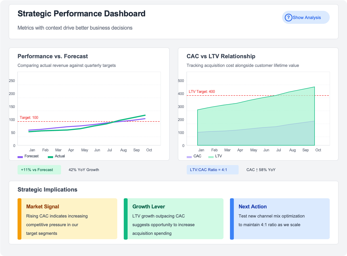
Always provide context to all metrics. Is a 6% increase in customer acquisition cost good or bad? You wouldn’t know unless it was read with contextual information. Here are some useful contextual information to include against your metrics. Just make sure you don’t overdo this and provide more context than necessary.
Comparison against a forecast, target or benchmark
Relationship between metrics e.g. increasing acquisition cost together with increasing lifetime value
Trend over timeframes
Thresholds indicating when a metric turns bad or good
Further metrics or insights explaining the ‘why’ behind a metric
Strategic overlay or expert analysis
Master the Art of Commentary
I used to think I should let the data do the talking itself, and I didn’t want my analysts to introduce bias with their commentary. I was probably put off by the many BI analysts who include pages of commentary which never got consumed.
However my perspective changed once I became a senior manager and then an executive, and I had to rely on reports and dashboards to run my business. I really didn’t have the time to identify which metrics really mattered, and interpret my dashboards to figure out key drivers and impacts of adjusting these drivers.
These days, I prefer my dashboards to come with short and succinct commentary based on the following guidelines -
Provide a succinct 1 line summary at the dashboard level
Explain why something has changed
Explain the impact of the change
Where possible, highlight key decision, or key question/next step to support decision making
Assign an owner to produce commentary
The key is providing enough commentary to give context & summary without burying key information in text. When a deeper explanation is needed, you could include this as an appendix. Don’t make the mistake of including pages of commentary.
Hot tip: This is a use case where AI can be used to fundamentally change your approach to executive reporting. Tools like PowerBI have had capability to produce commentary for a while, and these are now augmented with AI capability. There are also other apps, either standalone or add-on’s to tools like PowerBI which have better AI capabilities. While not prefect and requiring humans in the loop, AI is getting better, and can provide a quick way to provide your executive with an ‘executive data translator’.
Show visual restraint
Peacocks are flamboyant and colourful, your dashboards shouldn’t be!
Bright colours, images, gradients, 3D charts, custom icons - all these sounds great. But in reality, these prevent you from seeing the forest for the trees - or in the case of your dashboard, prevent you from seeing the data for the design.
Here are some simple guidelines I insist are incorporated in my dashboards, which makes consuming information much easier.
Use colour sparingly - only to highlight exceptions or draw attention
Embrace "boring" bar charts, tables & pie charts (gasp!!) when they communicate most clearly
Maintain white space to give important information room to breathe - this provides cognitive oxygen for your executive
Standardise dashboard design and keep visuals consistent
If your metrics don’t fit in one page, you have too many metrics. If a visual element doesn't help a decision or action, it's unnecessary and should be removed.
Visual restraint is important. Not just because it’s better aesthetics, it helps you communicate better.
Key Takeaways
After spending several years on either side of the dashboard, I have come to realise the key to a good dashboard is simplicity. However this is easier said than done - creating a simple dashboard takes more expertise and time compared to creating a complex dashboard.
Anyone can create a dashboard with 20 metrics, but it takes a true master to create one with 5 that actually drives decisions.
Have the courage to show constraint, and focus on simplicity, clarity & actionable insights.